Friday 30 November 2012

Digipak Ideas

As I mentioned in my last post, we've begun to brainstorm ideas for our digipak and poster.

These are the ideas we have for the digipak design:


This is a rough design of what we want our finished digipak will look like. The digipak design is very important as it hints at the genre and tone of the album/song, and the design itself helps to target a specific type of audience. 
It is vital that when producing our digipak that we keep within the conventions of the genre as well as try to attract an secondary audience in order to expand sales. 

Thursday 29 November 2012

Poster Ideas


My partner and I have started to brainstorm some ideas of what to include on our digipak and poster. We both agreed that we wanted something original and unusual for our poster to make it different from what everyone else is doing in our class.Here's a brainstorm of ideas which we have got now; which we hope to expand:


We also researched online and looked at examples of posters and art work to help expand our ideas, this also helped to visualize what our finished poster would look like.
Below are examples of posters/artwork which caught our eye:


This one I thought, the design was very interesting as it was like a mix of modern and vintage- making an artistic statement. 


I liked this poster because it effectively made the artist the centre of attention. The setting is very rural and natural hinting that the type of music would be easy-listening. The red flowers and white in this poster have all been enhanced; this creates contrast and draws the reader's eye to the title. The font is interesting as it is swirly, which can be seen as girly, and it is clearly printed so it is easy to read. 
 

Here is a typical pop (artist's) poster, this poster is very bold and catches the eye effectively. The artist is highlighted as she is in blue, contrasting the hot pink background. The singer's name is in big, bold, capital letters with the band underneath her name; this represents their role as they are the accompaniment supporting her. 
At the bottom is a smaller image of the album also stating that the album is  available to buy now - pushing downloads/purchases. 

Monday 26 November 2012

Treatment

This is the treatment for the coursework, the treatment is a document that expresses the ideas for a music video and how the idea relates to the artist and the song. 


Thursday 22 November 2012

Costumes

We used a couple of different costumes, depending on where and what we were filming, for the promo video.

For the dance studio:

A grey studded jumper with black leggings, 
Make-up and hair: hair down, natural make-up and stud earrings.


At Hainault Forest:

Leggings, mustache print top, a striped scarf, navy gloves, leather jacket, and high-top trainers. 
Make-up and hair: natural make-up and hair in a high bun and the same stud earrings as in the dance studio


Props

For the coursework we are going to use some props; props are important as they can reflect the music genre and mood of the song. 


At the start of the video we are also going to use shots of [my] keyboard to mimic the piano chords at the start. We also are going to use a guitar, which is also shown below:


A major prop that we are going to use is a silver heart necklace, which holds sentimental value to the character about a loved one- reflecting the acoustic music genre. 


In the chorus, a prop that we are going to use is cards with the lyrics of the song written on them. 

Monday 19 November 2012

Locations


Dance Studio


For the first minute or so of the video we are going to use the school's dance studio in the Robert Clack Leisure Centre.
This location is going to be used for shots of the character dancing to the music at the start of the song 'Paper People' when it is just the voice and piano.

Hainult Forest


Hainult is where we are going to shoot the rest of the video as it has a rustic and reflective feel like our chosen song. Hainult in the autumn is beautiful as it is ranges from different types of greens and at this time in the year the leaves have fallen which will help to add to the sombre mood. 

 
Sources:
Barking and Dagenham website
www.luphen.org.uk/walks/london_loop/london-loop02.htm&docid=S72BTeN6ufyRdM&imgurl=

Friday 16 November 2012

Wednesday 7 November 2012

Real Digipak Analysis


Katy Perry is a very bold character and her album/digipak refects that with its bright colours and bold patterns. The digipak has a sort of candy wonderland theme which is rather ecentric - just like her!
Two of the images of the artist is of her laying on a candyfloss-cloud (as you do) looking very sensual, in the third image she is making a fashion and artistic statement appealing to her more fashion-conscious fans.


The design represents Rihanna's more feminine side as she is surrounded by roses and her lips are red and full. All images have been edited to enhance red tones to make the album extra eye catching and 'loud' which the album is titled.

Analysis of student digipak, magazine advert and video combination

Here is the coursework which had been completed by a student from last year; this was a great opportunity to look at other's work to get an idea of what we need to include when it comes to my own coursework. I looked at Shelley Burgess's Music Video Blog from last year and her finished music video as she chose a similar artist within the same genre.

Poster


There is a medium shot of the artist placed in the centre to obtain attention, her lips are dark to draw attention to her mouth. The object placed around her neck looks like it's made from leaves and flowers etc suggesting she has raw talent and an innocence. 

The artist's name is in captials and underlined to clearly establish the artist name; the title of the song looks to be handwritten to give it a personal touch. 

There are logos such as hmv and itunes which everyone will recognise, the itunes one helps to promote downloads and is useful when targeting an target audience. As well as established logos there are also established company names, such as The Independant and NME, who give reviews of the song which makes the reader curious to hear what all the commotion is about.

Digipak


The title on the front cover of the digipak has been enlarged to draw attention, however it could have been made bolder or a different colour to create contrast as well as catch the customer's eye. There is a barcode on the back making the digipak realistic and creating a professional feel.

Inside there is a quote which I presume is a lyrical phrase from the song which could the focus of the theme of both video and digipak design. On one of the sides there is a coloured image which has been edited slightly to bring out blue tones implying the song is sombre, and underneath there is 'xoxo' in a handwritten font referring to the theme/nature of the song.

The finished music video


The song itself is rather dark and moody which reflects in the video. The video is made of a mixture of shots from a park/woodland area, past memories, southend beach, nature (e.g. water, moon) and of the actor standing behind a berry bush; almost masked even by the bush.
The colours are dull reflecting the dark mood/feel of the song; it's only the red berries that really create any contrast.

The actor lip syncs well, she looks into the camera straight on but sometimes looks down or to the side - it's not conventional but that seems to suit both song and actor and works well with the video.

Tuesday 6 November 2012

Magazine Advert Analysis

Famous Album art analysis

Here are some of the most iconic album covers and the reason why they are so special.

Pink Floyd-Dark side of the Moon


The design is supposed to represent three elements which are the band's stage lighting, the lyrics of the album and Richard Wright's request for a 'simple and bold' design. Even at first glance the album cover is striking with its black background and bold prism.

The prism has six colours, missing indigo, this is quite interesting as one of the album's alternative name is 'the dark side of the album.' The missing colour could also symbolise the missing member of the original band Syd Barrett who Walters writes about in some of the songs in the album e.g. 'Brain Damage.'

The Doors-Strange Days


Second album and an artistic triumph. Unlike all their other covers, the band is not on there as the leader singer Jim Morrison refused to appear on the cover of the album; instead there is a picture of street performers - availability of such photos were low. 

The band were looking for something different than what American bands at the time were doing, so this in many ways was perfect.
Jim apparently had even said to a reporter : “I hated the cover of our first album. So for Strange Days, I said: ‘I don’t want to be on this cover. Put a chick on it or something.’”


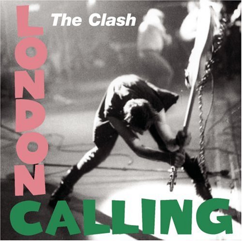
The Clash-London Calling


The album artwork is of the lead singer smashing his guitar at The Palladuim in New York 1979, the artwork itself is a homage to Elvis Presley's album in 1956, which was rated the ninth best album cover of all time by Q magazine in 2001.

U2-War

File:U2 War album cover.jpg

U2's third studio album, released on the 28th of February 1983.
The boy on the cover of the album is also on three other album covers including their debut album, 'Three,' and 'The best of 1980-1990.'

Bono described the decision of putting the boy on the cover: "Instead of putting tanks and guns on the cover, we've put a child's face. War can also be a mental thing, an emotional thing between loves. It doesn't have to be a physical thing."

Sources used: wikipedia.com

Monday 5 November 2012

Rough outline of Initial Ideas

Here are our brief ideas for the coursework so far; which we came up with today; at the end of the week these will be much detailed and hopefully soon we will start to film.

Key Music Video Conventions

Vox Pops

Before we do our actual target audience research we did a test run of a 'vox pop' to see how long the filming process would take and what editing would be needed. 
The next time I plan to include captions identifying each speaker including their age and occupation; which I forgot to do this time.

Here is the trial vox pop:


Saturday 3 November 2012

Detailed Research into our Artist

Charly Houston like most unsigned artists is on myspace and an unsigned website; but she also has also joined soundcloud and facebook. Soundcloud is a website where you can upload your demos online for others to listen to and also download (optional), this helps to reach out to your audience and other music lovers.


She also has her own Facebook page which she started in 2011 it features information about what gigs she is doing, ticket information, a band page where you can listen to music and view photos. This helps to interact with her fans and post the latest in 'the world of Charly.' Social media such as Twitter and Facebook is widely used and can be used effectively as a (viral) marketing tool as fans can tweet and share material with friends - and of course 'word by mouth' is the most effective tool there is!


Charly has also recieved positive reviews such as the one below:

"As professional as she is talented, Charly Houston undoubtedly has a very bright future ahead of her. I still can't quite believe she's only 15. Her voice has a rich, soulful, husky quality that singer-songwriters twice her age can only envy."
                                                                                        - Duncan Ross (Director, Klocwork)


A positive review can have positive effects and lure in interest from other music fans out there and possibly scouts looking for new, fresh talent.

Friday 2 November 2012

Artist Perfomance

This video is of Charly Houston performing Paper People live at her first headlining gig in March 2011.


Charly seems confident during this performance and likeable with the audience as she makes them feel comfortable joking with them before her performance. She has a natural stage presence as we the audience are drawn in when she performs and she makes her audience seem at ease/chilled as she performs which demonstrates good body language.

The performance itself has an intensity to it as Charly gets into the emotion of the song which shows in her voice and her facial expressions. The lyrics themself are sombre however when put together with Charly's husky tone and guitar chords have a playful quality.
She writes and performs with a maturity which makes you believe she is an artist and has been doing this for a while, it also makes her performance convincing as we believe every lyric.

Looking at this performance helps to visualise how the song should be performed, so when it comes to shooting our music video mimacing how the artist performs will be vital to keep the same tone and emotion of the song.