Thursday 28 March 2013

Evaluation; Question Four

4) How did you use new media technologies in the construction and research, planning and evaluation stages?

In this technological age, using new media technologies is vital when constructing, researching, planning and evaluating media products.
When constructing my own product I used a range of different technologies in order to research, plan, construct and evaluate my A2 Promo Video Coursework.

Research

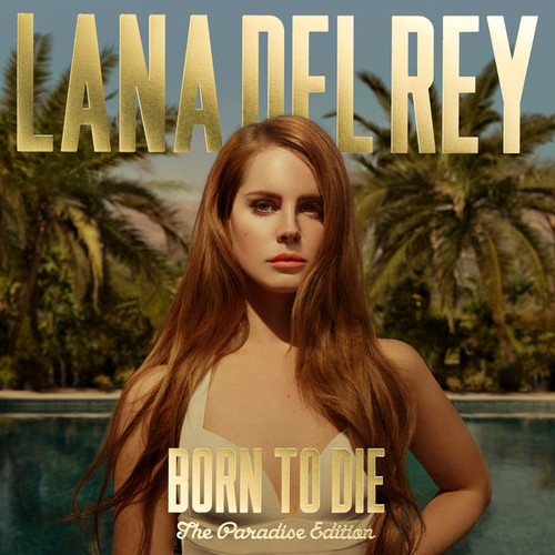
Before constructing or even planning to make a music video; there was a considerable amount of research that needed to be done.
Firstly I researched some of my personal, favourite music videos on Youtube to get an idea of what elements go into a music video. Once I had an idea of what to include into a music video, the next step was to find and receive permission from an unsigned artist.

To do this I used Unsigned.com; which is a website dedicated to showcasing talented unsigned artists. On Unsigned.com is where I found Charly Houston.


I listened to the song on her profile page (caption above), instantly I really liked her easy listening style. To find out more about Charly, I looked on her Youtube channel, that is where I found her song 'Paper People.'

(Below: Charly's Youtube Page)

I then emailed Charly asking for her permission to use her song 'Paper People' for my Music Video coursework.
Once I received permission, I then researched further into my chosen artist to get a better insight into her music and to get an idea of what to include in the video.
I looked on her Soundcloud, Myspace and Facebook pages.


Audience Research

For my audience research, I created a survey using Survey Monkey, the website is highly accessible and user friendly; this made the creation of the survey very quick and easy to create.

Once all results were collected, I used the 'Analysis' feature on Survey Monkey, to further breakdown the results.
I then presented the data collected on Survey Monkey using Padlet.com. I embedded my 'wall' onto my blog, the 'wall' itself is interactive and allows you to be creative in how you use the feature.
(Below: my wall; which is featured on my blog)


Planning

When planning the music video I used google docs, which I downloaded from our media department's blog. I used google docs for the Risk Assessment and the Contingency Plan.

The treatment was uploaded to slideshare; which I then embedded in my blog.

The animatic was made using Windows Movie Maker, which is a basic editing program.
The rest of the planning were published as blog posts on my blog page.

Construction

When filming our video, I used a Canon HV20 camera, which records in High Definition.


(Picture below of filming in Hainault)


To edit the footage we used Final Cut Express. Final Cut Express is a professional editing software which allows you to edit many different medias.

I used Adobe Photoshop to make the magazine advert and the digipak. Photoshop has many sophisticated tools to enable you to create professional looking images. Once I got used to the program, it was very easy to use.

(Below: editing an image for he digipak)

Evaluation

For my first and second evaluation questions I used Slideshare which is a website that allows you to search and upload PowerPoint presentations, videos and word documents. Slideshare is very easy and straight forward to use, and is very popular.
I used Prezi for my third evaluation, I included screen grabs from Survey Monkey.

And for my forth evaluation question, and final blog post which you are reading now, I used Blogger.com - a website that I have blogged about the whole coursework process. Blogger is a diverse blog website that covers a range of topics; you can search, read and follow certain blogs as you wish and it's free. 

Evaluation; Question Three


Tuesday 26 March 2013

Review of Music Video

Evaluation
The dark colours and empty location are all conventions of the acoustic genre, as well as the use of instruments and lip syncing are typical conventions of most music videos.

The slow paced editing matches the slow pace of the song and adds to the sombre mood of the video. The dissolves are effective as they help to transition the video from one scene/location to the next. Generally, the video transitions help to bring out the mood of the song hence making the meaning of the video apparent to the viewer. 

In the video there is only one character: a young female. In the video the actor can appear fragile and vulnerable in some parts ( such as the forest scenes); but in the guitar and dance shots she seems strong and dominant. I wouldn't say that there is use of stereotypes in the video as the video is not about a statement on society or political views.    

I would imagine if the video was to be played on any music channels it would probably be on 4Music and Smash Hits! as they are music channels targeted at the younger viewers aged between 14- 24 years old; and perhaps MTV Rocks as they show alternative and acoustic music videos as well as rock videos. Due to the content of the video, I would say that the video would be able to be shown during the day as there is no offencive content.

Finished Music Promo Video

Here is the finished music promo video for 'Paper People'

Video Narrative: The narrative of the video is that the protagonist is looking for clarity on a present event, the protagonist has to over come self-conflict and doubt to find the answer which she is searching for.

The Finished Digipak

This is our finished digipak, which I edited using Photoshop.


After much debate, we changed the front cover of the digipak because the original photo was blurred and pixeluated. I think that the new front cover reflects the genre more and it is more stronger visually. It also looks like a real front cover of a CD/Digipak which is an added bonus. 

Monday 25 March 2013

Sunday 24 March 2013

Magazine Advert:The Design

Over the weekend I designed the poster for the music video.
Posters and digipaks are important as they help to promote the artist as well as reflect the genre and tone of the single/album. We're sticking to a black and white/saturated theme to reflect the sombre mood of the song. 

Before coming up with any ideas I looked at Charly's own album art work.
The letters of her name and single are in capitals, bold and she too uses black and white. 
I liked the boldness and wanted to keep with that idea.


So for our own poster we are going to have a photo of Ellie and big bold letters 'Paper People' to really grap the attention of the viewer/reader for the magazine advert.

Friday 22 March 2013

New Storyboard

Because Ellie and I have changed our orginal idea so much, we've created another storyboard and animatic to illustrate our new ideas and what our msuci video will look like when it is complete.

Storyboard:

Thursday 21 March 2013

Updated Shot List

This is an updated version of our music video shot list.

Shot List

Scene 1 First Verse
Shots: Mixed shots of black and white piano shots, lip syncing and dance
Description: The piano shots are close-up shots focusing on the hands pressing down on the chords. The lipsyncing shots are midshots of the protagonist looking and singing into the mirror in the dance studio, the camera is positioned just behind the actor in order to capture the reflection on the mirror. The dance shots are mostly long shots of turns and other dance moves.

Scene 2
Shots: Hainault Forest and guitar shots
Description: Shots of Ellie walking through Hainault dissolving to shot of her sitting on a stool playing a guitar and singing 

Scene 3
Shots: Guitar and dance shots
Description: Shots of Ellie playing guitar and singing; and dance studio shots

Scene 4 Chorus
Shots: Black and white singing shots
Description:Close-up, black and white shots of Ellie singing the chorus against a white wall

Scene 5 Second Verse/ Hainault
Shots: Hainault Forest
Description: Shots taken in Hainault Forest of the protagonist walking through the trees, singing and an extreme close-up shot focusing on the actor's eyes.

Scene 6 Second verse
Shots: Guitar, Hainault and dance shots
Description: Mid-shots of guitar playing and singing; mid-shots of Ellie singing in Hainault and shots of the Hainault area; and dance studio shots

Scene 7 Pre-chorus and Chorus
Shots: Lipsyncing and dancing
Description: Mixed shots of singing (against a blank background, looking out of a window and guitar) and varied dance shots

Scene 8 Last Chorus/Ending
Shots: Mixed shots of singing and dance
Description: Mixed of lipsyncing shots from: Hainault, against a blank background and playing a guitar. Last shots are of Ellie dancing and lyric writing.

Tuesday 19 March 2013

Editing 19/03/13

19/03/13

Today we finished off completing the corrections/feedback that our media teachers gave us and we have produced another draft of the video.
Next week we will show our media teacher, Mr Johnson, our video the cohopefully we have made all corrections needed.

Monday 18 March 2013

Editing 18/03/13

18/03/13

Following up on what our teacher said; we got straight to working on those corrections.
We put another clip of Ellie, walking through Hainault, at the start of the video to establish that she is in the forest, and that the persona is looking back on a memory.

We also changed some of our guitar clips at the start of the video to show a variety of shots. 

Review of First Cut

Today on of our media teachers watched our first cut of the music video.
We got mostly good feedback; with the exception of  two corrections that need to be made.

The corrections were: to introduce the Hainault footage earlier on in the video and to change some of our clips.


Thursday 14 March 2013

First Cut of Video

Here's our first draft of the music video:


On Monday our video is going to be reviewed by a member of staff, and we will should hopefully be given back positive feedback.

Editing 14/03/13

14/03/13

Today I finished adding in the video transitions to make the video look better and more fluid. 

I also made some of the clips black and white; so that the black and white scenes reoccur throughout the video, this was one of the suggestions we were given by our media teacher(s). I made the shots of Ellie singing against a white wall black and white as they were the only shots that looked good desaturated as well as they occur more evenly through the video so it made sense to make them clips black and white.

Wednesday 13 March 2013

Editing 13/03/13

13/03/13

After filming today, we went to the media rooms and edited the footage that we captured today.
We did take bits out of the video such as the notepad writing, the cards, the heart being drawn and any other shots that we felt that it wasn't needed and didn't fit in. We spaced out the dance clips as much as we could and filled up gaps with the footage that we took today.
Finally there are no more gaps!

We started to add in the video transitions, such as cross dissolves and fades to keep within the style and music genre, this helped to make the video more fluid and made it look much more professional.

Tomorrow we will look through the video and see if any more video transitions need to be made, then hopefully we can publish a first draft!
Next week one of media teachers said that she is going to look at our video and give us feedback, and any pointers on how to improve our video.

Filming 13/03/13

Today we filmed some extra footage for our music video in one of the Drama classes,
We also used a guitar from the Music Department for the scenes today.

An advantage when filming today in one of the drama classes is that there was a plain black back-drop, many props to choose from and we could play around with the lighting; which helped to draw the audience's attention to the actor/singer.
We also used different coloured lights, like red, which helped to add warmth to the scene.

When filming, Ellie sat on a stool and pretended that she was playing the acoustic guitar. We also shot footage of Ellie 'playing' and singing which looked quite good when watching the footage.
We did many takes and tried many different angles and positions so that we had enough footage when it comes to editing.
Overall I was very pleased of how the shots turned out and I feel that we got all the shots that we needed.

Tuesday 12 March 2013

Extra Filming

Below is information of the extra dates we are filming and what we will be filming.

Date: 13/02/13
Scene(s): Playing guitar and some lip syncing
Location: Drama Department at Robert Clack Upper School
Equipment: Camera, tripod
Costume: Black leggings, black high-top trainers, cream, sequined jumper and stud earrings
Hair and Make-up: Hair straightened, make-up natural
Props: Guitar

Monday 11 March 2013

Editing 11/03/12

11/03/13

Today I started to play around with the video transition effects to see what would fit in with out music video and style of music.
At the start of the video, when the shots are switching from singing, dance and piano I added some cross dissolve transitions which really helped to bring the video to life and capture the sombre tone we are looking to create.

Our media teachers watched our music video today and gave us some really good feedback on how to make the video better. They said that the dance and Hainault clips need to be spread throughout the video to make it more even and so that the clips tie-in well.

Our teachers said that the black and white shots of the piano bits were good and it was a shame that they weren't continued throughout. A suggestion that was made is that we could film some more piano bits and add guitar scenes, making it seem like Ellie is playing the instruments. This also would tie-in well with our music genre and give the video something a little more special.

Taking these suggestions on board, Ellie and I agreed to film some piano and guitar shots as well as re-film the notepad clips.
This does seem quite time-consuming, especially so late in the coursework process, but I think that the music video will benefit a lot from this and it shouldn't take so long to edit as the video is almost complete and we've become more accustomed with the editing program.

Tuesday 5 March 2013

Editing 04/03/13 - 05/03/13

04/03/12 - 05/03/12

Through these past two days Ellie and I have looked over all the footage we have recorded so far and we've almost filled in the gaps in our music video, with the exception of one last gap.
We've edited in more of the dance footage towards the end of the video, and managed to fill in the first and second verse of the video which we were having difficulty with.

Looking over the notepad footage Ellie noticed that some of the lyrics were wrong, so later next week we are going to re-record that part.
Next week we also need to start adding transitions between the clips to make the video visually interesting and to make the video more fluid.

Next lesson our media teacher is going to watch what we've done so far; and hopefully give us feedback on how to improve the video.

Monday 25 February 2013

Half Term: Coursework Update

So far we've been able to fill in most of the music video; however there are still some gaps that need to be filled with clips, which we will do after half-term.
After the video is complete we then need to add in transitions to make the video more fluid when going from one clip/location to the next.

The digipak is complete now, so all there is left is the magazine advert/poster that needs to be completed.


Thursday 7 February 2013

Editing 07/02/13

07/02/13

Today we looked over the footage which we captured yesterday, and sorted through to find shots in particular which we liked which we then cut, then sorted through where to put each clip in our video.


We managed to fill up the first and second verses, and most of the chorus parts; the middle part of the song is now complete all there is to do now is to fill-in the start and finish off the end of the song which we will do at the start of next week. 

Wednesday 6 February 2013

Filming 06/02/13

06/02/13

Today we filmed some extra shots of Ellie lip-syncing against a white background, so that we can include some more lipsyncing to our music video which we need badly and so we can fill in any gaps that we have so far.

We filmed at my house in the early afternoon to make use of the natural lighting. 
We tried filming form different angles and distances for diversity. Also, I filmed Ellie singing looking out from a window, deep in thought, this was experimental so it will be interesting to see what the shots look like tomorrow when we edit what we've done today.

Extra Filming

Here are the dates and details of the extra filming; which we are going to film for our music video:


Date: 06/02/13
Scene(s): Singing against a white background, focus on actors eyes and the emotion of the song
Location: Jessica's house
Equipment: Camera, tripod
Costume: White t-shirt with 'moustache' print, black leggings, black high-top trainers.
                  Hair is straightened and make is natural looking. Jewellery: diamante stud earrings.
Props: N/A

Tuesday 5 February 2013

Shot List

This is a list of shots that are included in our video.


Shot List

Scene 1 The Beginning
Shots: Mixed shots of black and white piano shots, lip syncing and dance
Description: The piano shots are close-up shots focusing on the hands pressing down on the chords. The lipsyncing shots are midshots of the protagonist looking and singing into the mirror in the dance studio, the camera is positioned just behind the actor in order to capture the reflection on the mirror. The dance shots are mostly long shots of turns and other dance moves.

Scene 2 First Verse
Shots: Lipsyncing and dancing
Description: There are varied shots of the protagonist singing against a white wall as well as long and medium shots of dancing from the dance studio

Scene 3 Pre-chorus and Chorus
Shots: Heart and singing
Description: Close-up shot of drawing a heart on a piece of card in pen with singing the chorus, against a white wall.

Scene 4 Second Verse
Shots: Hainault Forest
Description: Shots taken in Hainault Forest of the protagonist walking through the trees, singing and an extreme close-up shot focusing on the actor's eyes.

Scene 5 Pre-chorus and Chorus
Shots: Lipsyncing and dancing
Description: Mixed shots of singing (against a blank background and looking out of a window) and varied dance shots

Scene 6 Last Chorus/Ending
Shots: Mixed shots of singing
Description: Mixed of lipsyncing shots captured, one from Hainault and the other shots against a blank background and singing looking out from a window

Monday 4 February 2013

New idea for Opening of Our Music Video

Whilst watching music videos on Youtube, an advert came up advertising a new artist and their new music video, normally I would skip these adverts but this one caught my eye...

The music video was for the song 'Lost and Found' by Lianne La Havas.
The opening of the video was in black and white and the opening looked very artistic; this video gave Ellie and I the idea to change our opening of our music video to how this video opens. 
The artist's name and title of the song was well advertised in the video as they are big and bold; drawing in the audience.


To adapt the start of the video to our coursework, we are going to reshoot the start of the video adding in a scene where the protagonist is dancing in the far distance, the shot will be blurred and in black and white, then the titles will dissolve in and out. First the artist's name will appear in the centre of the shot and in a large font size, then the title of the song will dissolve in just slightly smaller in size compared to the artist's name. 

Friday 1 February 2013

New Ideas

Before filming doing any extra filming we first need to brainstorm some ideas on what to film and where etc. Looking back at the footage which we have so far, the dance studio bits look amazing and one of our teachers advised us that maybe we could focus on the dance studio, which Ellie and I have agreed to do. Looking through our music video, there is not a lot of lipsyncing throughout, so when we go to film more we will definately film some more lipsyncing.

For inspiration Ellie and I searched through music video using Youtube. The videos we looked at were Adele's 'Chasing Pavements'and Beyonce's 'Halo'.

I did some further research myself at home, watching different music videos and picking out bits which I liked.
The first video I looked up was Pixie Lott's 'Broken Arrow' as it is the same sort of mood, self-conflict theme and has too dance studio scenes.
I liked how the protagonist's emotions were expressed through dance, which we also have included in our own video. I also liked how flattering the close-up shots were of the singer, the shots really portrayed the feel of the song, the shots were diverse - which is another thing that we need to include in our own music video.


Then I looked at Christina Aguliera's 'You Lost Me', which is another similar song with the themes being conflict, loss and reflection. In this video I particularly liked the use/ lack of colour as it shows the portagonist's pain and distress, the lack of colour helped to make the artist the focus of the video as it helped to draw focus to her red lipstick and blue eye contacts.


Then I looked at one of my favourite videos by AaRON - '(lili) U-Turn' which I looked at and briefly analysed at the start of the course.


Afterwards, Ellie and I brainstormed some ideas and this is what we came up with:
  • Redo the beginning: blurred shot of the protagonist dancing in the distance in black and white, the artist's name and the title of the song then should disolve in and out.
  • Need to include more lip sync shots
  • Shots of actor singing (against a white wall so that there is no background)
  • Extra dance shots
  • Include spilt screens
  • Change of costume

Tuesday 29 January 2013

Making the Digipak: Part II

Back Cover
I used Photoshop to create the back cover, like I did with all the digipak photos.
The back cover photo is a prop photo I took when filming late last year. I made the picture black and white and increased the contrast, then I added the song titles, record label and barcode(which I created) then added the rights at the bottom.


Side Panel
For the side panel I just edited a dance studio screenshot, I made the photo black and white then I put a film grain layer on the image to create a rough/drawn out effect.

Monday 28 January 2013

Front Cover of the digipak

Finally we have a front cover for the digipak!
Ellie looked over some of her own personal photos and saw a photo which would fit within our theme. She then sent over the photo to me; which I then edited.
I used photoshop to crop and change the photo to black and white, afterwards I used an effect on the filter tab which made the picture look sketchy.
Then I added the titles and the name of the artist, making sure the name of the artist was bigger than the title of the song.

Friday 25 January 2013

Making the Digipak: Part I

25/01/13

To make the digipak I used Photoshop, which is fairly easy to use once you've had experience using the program. I chose to use Photoshop as it has sophisticated tools which enable to create professional and more complex images; that you wouldn't be able to create using other software programs. 

The first image I edited was a Hainult image which we are going to se for the CD panel; the editing for this image was simple as I just changed the image to black and white, increased the contrast and added dark mid-tones. 


Then I selected one of the guitar photos, which I took when taking pictures of the props, and edited that image. I duplicated the image, making one black and white and leaving the duplicate in colour. Only making the black and white copy visible, I then used the magnetic lasso tool to outline the guitar, once that I did that I then cut the guitar out of the image and made the colour copy visible. 
The outcome was that everything in the picture was in black and white except the guitar which is bright blue - making the guitar the focus of the image.
Then Ellie suggested that we should add some writing on the wall of the image to make it look like some of the lyrics were written on the wall. To do this I simply used the text tool and typed the chorus lyrics, afterwards I adjusted the font size, style and the position of the text.


Dance studio collage
I chose a light blue background for the image. I opened the picture of Ellie elevated then used the magnetic lasso tool to cut her out of that image and paste it onto the blue background. After doing that I used the eraser tool to get erase any objects or background from the silhouette. Once everything was done I resized the image and placed it to the top-left.


Then I imported another photo, when Ellie was looking into the mirror and singing, and copied and pasted it to the bottom right-hand corner. Once both photos were positioned I used the eraser tool, 75 in dimeter and it had a blur/smudge like effect, to blur/smudge the corners of the photos. When I had done that I looked back at the image and thought it looked dream-like, so I took some more screenshots and edited that into the picture. Once I started, it began to look great so I carried on until I achieved the desired digipak image which I had pictured in my head when brainstorming ideas. 


Wednesday 23 January 2013

Researching Front Album Covers

We've started to edit photos for our digipak, but there's something still missing: our front cover.
So far we have no ideas, so I researched some real-life front covers for some ideas.

Adele: 21

It seems most front album covers seem to be close-up shots of the artist; here is a classic example. The camera shot focuses on Adele's face and the black and white helps to contour and emphasise her facial features. The album title is in a lime green which helps it to stand out.

Beyonce: dangerously in love

The plain blue background helps to make the artist stand out. Beyonce is covered in diamonds/diamantes which makes her look regal and also links in with her hip-hop/pop genre of music. The sheer top makes her look sensual, the album cover would appeal to both men and women as she looks striking and confident.
The name of the artist and the title of the album is in silver, which also links to the music genre. The name of the artist is larger than the title to make it out more as she is an established and popular artist.

Rihanna: Good Girl Gone Bad Reloaded

The background colours go from light teal to dark teal emphasising the title and the theme of good vs. evil. The artist is in black and white, the lighting makes the white bodycon dress stand out which makes the artist look sensual. The artist's name are in big capital, red letters and centred in the middle of the album to catch attention from on-lookers and buyers. The 'reloaded' bit is in red as well, highlighting that the album has been released.
The teal and the red colours reflect the playfulness and urban themes of the music genre, they also are (almost) complimentary colours which helps to create contrast.

Lana Del Rey: Born To Die: The Paradise Edition

The gold artist and album titles stand out from the background image as well as reflect the urban/ hip-hop element to the artist's music. The artist is at the centre of the cover to make her stand out, the artist is dressed in a vintage top/dress which reflects the artist's image and music genre. In the background are palm trees and a deep blue swimming pool reflecting the album title 'The paradise edition', it also makes the customer think that this album will be easy listening.

James Morrison: Song for you, truths for me

The saturated colours draw on the sombre mood of the album, whilst the tan coat draws attention to the artist who is sitting there in deep thought and self-conflict, also reflecting the acoustic genre of the album. The artist's name is in big red letters at the bottom left hand side of the album, the title is in a smaller font size underneath the artist's name. The font of the titles look worn out, again hinting at the type of music that will be on the album.

Radiohead: In Rainbows

'In Rainbows' is quite different from all the other albums I looked at. The album reflects the title as here they have used the colours from the rainbow, apart from purple. The title is repeated 4 times on the album with the artist's name written twice underneath.
The picture in the background looks science-related as it looks like a chemical reaction/explosion. The album cover itself is rather unusual, perhaps reflecting the alternative genre of the artist/album.

Tuesday 22 January 2013

Designing a Record logo

To make the digipak and the poster seem realistic, and look professional, I created a record company logo. I called the company: New Stars Records, keeping within the 'star' theme I chose the colours  black and silver as it will show-up against the black background of the poster and it will show on the digipak clearly as well.

I created the logo using Adobe Illustrator and only used simple tools such as the paint tool and the fill tool, after creating the image I saved it as a JPEG which is a common format for websites and other devices/uses. JPEG images can be easily compressed, so if I need to make the image smaller it will be easy to do and the image will still be good quality.
So when we post our poster and digipak watch out for the logo!

Editing 23/01/13

22/01/13

Today we edited some more of the video, and added a few clips in. After looking over the dance clips and the Hainult clips we chose some that worked and put them in the video to fill some of the gaps. 
There wasn't a lot of lip syncing clips to be put in as we need to film some more; but we worked with what we had and chose the best clips we could find and agree on. 
We put some more dance clips in which reflects the self-conflict and shows expression. 
Although we did not do much compared to other days, the editing we did do has helped to fill in gaps that need to be filled, and it highlighted what we need to go and film again/extra. 

Monday 21 January 2013

Researching Posters: My Morning Jacket

My Morning Jacket, who are an American psychedelic rock band, have had many interesting posters to go with each of their tours and albums. Their posters are quite artist and normally have some deep, and sometimes ironic, meaning to them.


This poster is very colourful and bright, which helps to draw attention to itself. There are two owls that overlap each other creating an optical illusion almost. The details of the event are in a sea green colour at the bottom of the poster.


This is the 'Z' album poster and album artwork, this was the band's forth album which raised the band's profile in the media. In 2005 the songs on this album were featured in a special My Morning Jacket episode of Amercian Dad (by the creators of Family Guy) in which the band also starred, this helped to raise their profile even more and expand their fan base.
The poster itself doesn't feature the band's name but does include the title of the album in each corner of the poster, the red title contrasts the blue and black theme of the poster making the title stand out. The poster itself shows an owl (a reoccurring animal in their posters and album artwork) being cut open by bird looking creatures, they find a working city rather than body parts. The owls eyes are a goldy colour which stare straight on the reader/on-looker.


Here is a concert poster for one of their tours, this one is a special edition for the New York concert in 2008, the artist who designed the poster is Guy Burwell.
In the poster it seems New York has been tranformed into ancient Rome as the microphone figure wears leaves on his head, holds a staff and is dressed in robes. There is an comic-like feel to the poster with the use of strong lines and bold colours.
Famous music buildings/ landmarks (Radio City) are included in the drawing as the microphone figure uses the famous building as a throne.

Saturday 19 January 2013

Researching Posters

Before designing our own poster, we researched some other similar posters and artists to get some more ideas.
First I looked at an acoustic artist, then two pop artists
Katie Melua

The poster design looks quite artistic as the artist looks like she's been sketched, the background also looks like a sketch of Rome: the city of classical music. The purple colours themselves are quite warm as they have red undertones, the colour purple suggests that the artist is of high status as purple is a regal colour.
The artist's name is in bold, clear printed, large sized letters that draw attention to itself. At the bottom of the poster there is the artists offical website and there is a logo on the bottom-right hand side which perhaps is her label or the company who is promoting the tour.


Michael Jackson


The white background makes the artist stand out here. Michael is also doing one of his famous dance moves which would have been known world-wide, so all audiences would have known who this was.
The artist's name is in bold, black,  captial, large letters centred at the top of the poster. The title of the album/single is in a bright red and looks like it has been spray painted adding to this 'bad' or rebel theme of the album. The red title and the artist name which is in black contrasts the white background and makes both objects stand out.


Whitney Houston


There is a close-up shot of the artists face, her makeup emphasises her brown eyes and her mouth (which is in a deep red colour). Also there is a small picture at the bottom left-hand side of the poster showing the album artwork.
The artist and the title of the album are in bold, white, large, capital letters; whereas information about the album is at the bottom and in a purple/grey colour and smaller in font size.

Monday 14 January 2013

The Digipak: Ideas so far

We have chosen to go with a black, white theme to keep within the acoustic genre. 

Each panel of the digipak will be unique and reflect the genre of the song.
Here is what we are going to include on the digipak:

1. The front cover
2. The Back cover: paper chains/cut-outs in black and white including song title(s) and additional info: barcodes, record label, dates, etc.
3. The CD panel: a black and white picture of Hainult Forest
4. A picture of a guitar standing up against the wall with the chorus lyrics written on the wall
5. A collage of screenshots of the dance studio part in the music video
6. Another collage of photos in black and white


We haven't yet decided on an idea for the front cover yet, so I plan to do some research and then brainstorm some ideas with my partner.
I have already started to edit the photos, there are still more shots that I need to take and edit but hopefully that shouldn't take very long. 
And I used this website: http://www.barcodesinc.com/ to create a custom barcode for the digipak, next I need to make a record label logo for both digipak and poster.

Thursday 10 January 2013

Coursework Update

Before the Christmas holidays we started to edit the music video, when editing we noticed that we needed to go back and film some more as there were gaps that needed to be filled. 

This term I plan to edit the digipak, poster and hopefully we can do some extra filming.
Looking over the footage it would be nice if we could go back to the dance studio and film some more there, as what we did film worked really well. 
So we need to make plans to film in the dance studio and perhaps film some more outside footage.