So far we have no ideas, so I researched some real-life front covers for some ideas.
Adele: 21

It seems most front album covers seem to be close-up shots of the artist; here is a classic example. The camera shot focuses on Adele's face and the black and white helps to contour and emphasise her facial features. The album title is in a lime green which helps it to stand out.
Beyonce: dangerously in love

The plain blue background helps to make the artist stand out. Beyonce is covered in diamonds/diamantes which makes her look regal and also links in with her hip-hop/pop genre of music. The sheer top makes her look sensual, the album cover would appeal to both men and women as she looks striking and confident.
The name of the artist and the title of the album is in silver, which also links to the music genre. The name of the artist is larger than the title to make it out more as she is an established and popular artist.
Rihanna: Good Girl Gone Bad Reloaded

The background colours go from light teal to dark teal emphasising the title and the theme of good vs. evil. The artist is in black and white, the lighting makes the white bodycon dress stand out which makes the artist look sensual. The artist's name are in big capital, red letters and centred in the middle of the album to catch attention from on-lookers and buyers. The 'reloaded' bit is in red as well, highlighting that the album has been released.
The teal and the red colours reflect the playfulness and urban themes of the music genre, they also are (almost) complimentary colours which helps to create contrast.
Lana Del Rey: Born To Die: The Paradise Edition
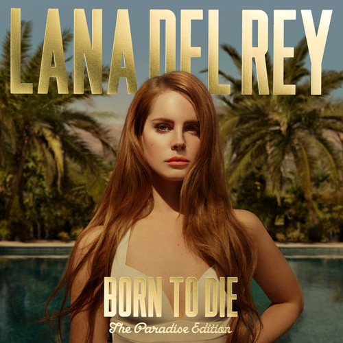
The gold artist and album titles stand out from the background image as well as reflect the urban/ hip-hop element to the artist's music. The artist is at the centre of the cover to make her stand out, the artist is dressed in a vintage top/dress which reflects the artist's image and music genre. In the background are palm trees and a deep blue swimming pool reflecting the album title 'The paradise edition', it also makes the customer think that this album will be easy listening.
James Morrison: Song for you, truths for me

The saturated colours draw on the sombre mood of the album, whilst the tan coat draws attention to the artist who is sitting there in deep thought and self-conflict, also reflecting the acoustic genre of the album. The artist's name is in big red letters at the bottom left hand side of the album, the title is in a smaller font size underneath the artist's name. The font of the titles look worn out, again hinting at the type of music that will be on the album.
Radiohead: In Rainbows
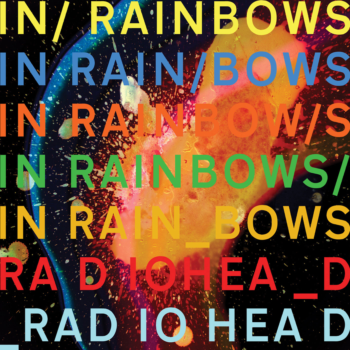
'In Rainbows' is quite different from all the other albums I looked at. The album reflects the title as here they have used the colours from the rainbow, apart from purple. The title is repeated 4 times on the album with the artist's name written twice underneath.
The picture in the background looks science-related as it looks like a chemical reaction/explosion. The album cover itself is rather unusual, perhaps reflecting the alternative genre of the artist/album.
No comments:
Post a Comment